- Challenge
-
Discover pain points of the current app and propose solutions to improve user experience
- Deliverables
-
User research report, Persona, Sketches, Prototype.
- Role
-
UX Designer
Challenge
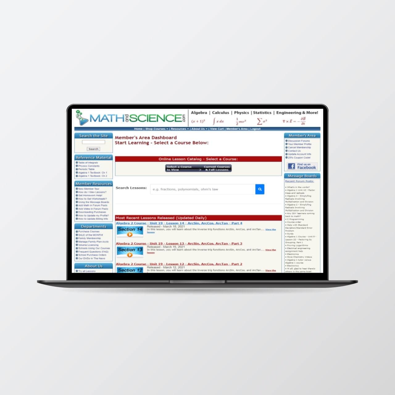
The challenge is to understand the user’s response to the current website, discover pain points and propose a solution to improve their experiences.
Process
For the initial user research, I conducted guerilla usability testing to understand the current problems.
During the synthesis phase, I focused on the common problems based on the study.
Then I created rough Lo-Fi sketches for
ideation and eventually Hi-Fi clickable prototypes. The project timeline is three weeks.
Now let's go deeper into each step:
Research
Geurilla Usability Testing
I first did research to understand the target audience of MathandScience.com.
During the testing phase, I spoke with my 10 users to uncover pain points while using the website. The selected users comprise students and educators.
I gave each user three different tasks to complete within the website:
- Imagine you are an undergrad freshman who is struggling to understand the materials in school, and want to find resources to complement your school notes. A friend recommended you to the MathandScience website. Could you show me what you would do?
- Now that you are convinced that you would invest in the paid service to get full access to all the materials. What would you do?
- Say you are doing your revision and want to refer back to the video you watched on the website. What would you do?
Synthesis
Based on the study:
- Difficult to quickly revisit watched materials
- Difficult to find materials easily
- Overall content are disorganised
- Difficult to watch based on target audience learning level
Personas
To help communicate information about users that I collected during research, I created a provisional persona.

Emily Heskey, 20, Relationship, Undergrad student
Behaviours:
- Lives far from school
- Works part time as barista
- Studies alone independently
- Loves learning
Needs:
- Wants additional study materials to complement her understanding in school
- Uses her travelling time to study
- Uses pastime to learn new things outside her school syllabus
Ideate
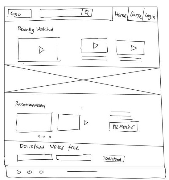
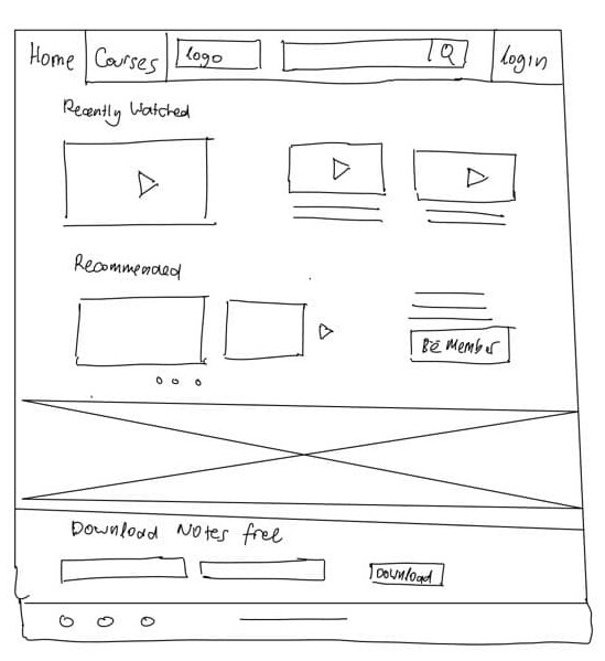
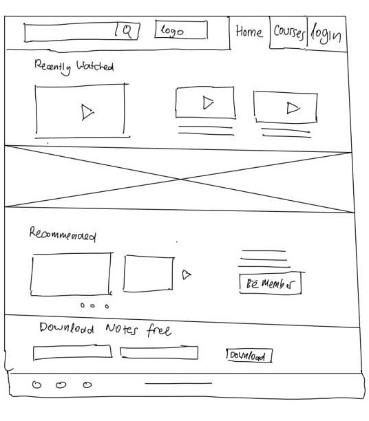
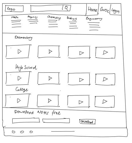
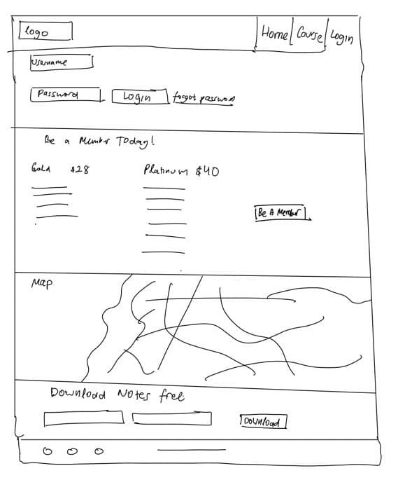
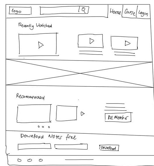
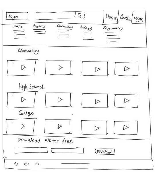
Lo-Fi sketches
Based on the established pain points, I sketched multiple options to test and see how by initiating minimal changes to optimize the user experience.
During the process of redesign, I continued referring to the target audience and my goal to focus on how to improve the user experience rather than making design changes.
After a few rounds of iterations I came to a good place with the solutions.
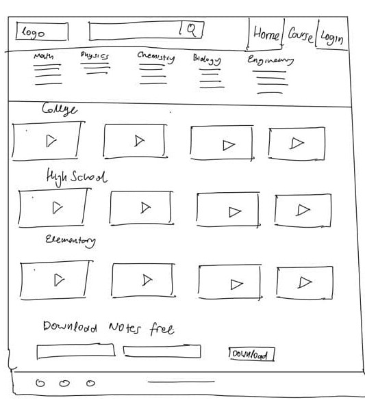
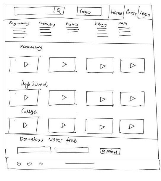
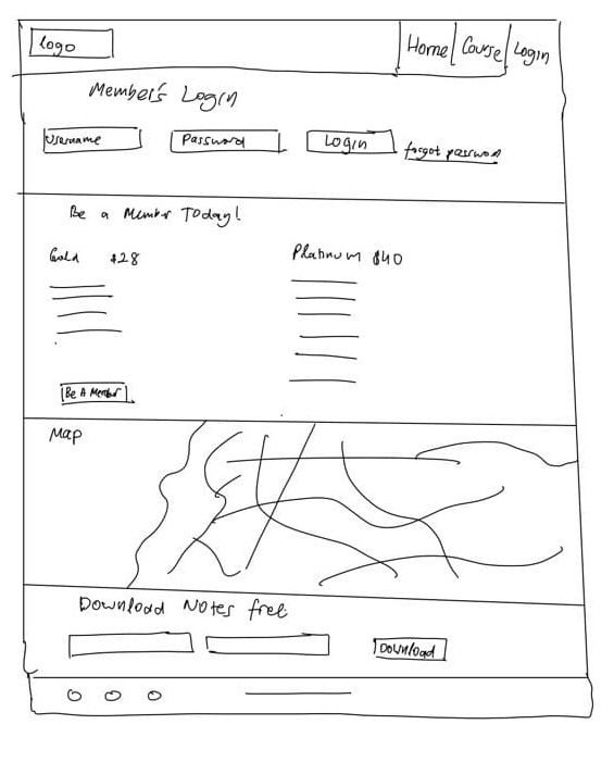
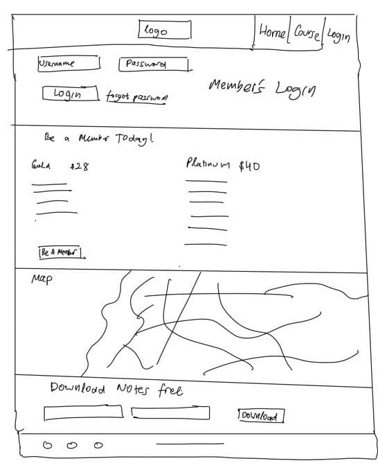
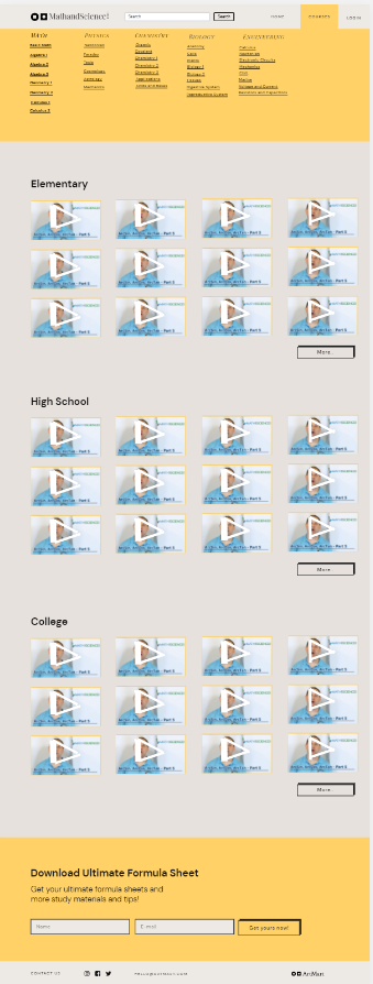
Prototype
Hi-Fi Prototype
Moving forward with the process, I turned my Lo-Fi sketches into Hi-Fi prototypes.
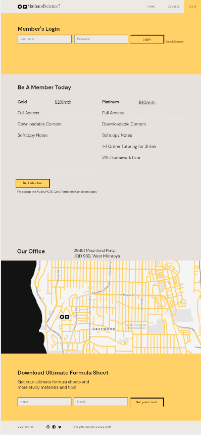
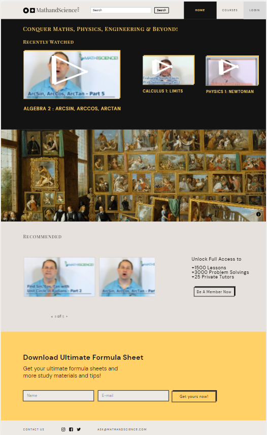
Below are the screen comparisons showing before and after side by side.
Clickable Prototype
I generated animated prototypes with activities from browsing, selecting and purchasing paid service.
The new design allows users to easily access materials and revisit watched materials quickly.
It was extremely helpful for me to test users on the tasks that I focused on to gain realistic insights, also understand what worked well and what features require further improvement.
The prototype only covers the aspects of tasks that I planned to test users on.
Click below to launch prototype!
Validate
| Tasks |
Before |
After |
| Ability to easily find materials |
4/10 subjects |
10/10 subjects |
| Ability to revisit watched materials quickly |
1/10 subjects |
10/10 subjects |
| Ability to access materials based on target audience learning level |
3/10 subjects |
9/10 subjects |
Conclusion
After two weeks of user research, analysis and redesign, I was able to validate assumptions and challenges I had made.
I did this by testing my clickable prototype with 12 new users. The results are:
- Searching for specific materials: 12 out of 12 uses were able to find in an organised manner
- Revisiting watched materials quickly: 11 out of 12 users were able to find it quickly
- Filters based on learning level: 11 out of 12 users were able to sort and select easily
After Thoughts
This UX case study has been a challenging and rewarding experience for me. At the beginning, I was overwhelmed by the idea of making a case study as a side project. However it turned out to be an amazing experience to understand users and find out what makes the tick.
I am glad to learn that even by making small changes, we are able to yield big impacts and create a great experience for users. It is so important to always validate our assumption through testing.